#4 Roam Research — What comes after a renaissance?
On mixing ideas, evolving design patterns and finding a soul
About the identity
Roam Research is a note-taking tool renowned for popularizing the networked thinking method.
A new year has come. It's 2024 and note-taking isn’t cool anymore. The once-blooming space has had its moment. Moreover, the almighty Roam Research isn’t the only king anymore.
The hype is officially over.
At this time of year, when many are busy reflecting on the past year while excitingly looking into the future, I realized it's a good opportunity to look back at Roam’s madness timeline. The company that took Twitterverse and Silicon Valley by storm is now long after its breakthrough.
Roam was one of those phenomena that happen every other few years. Its appearance in our lives not only made the “tools for thought” niche fashionable. It marked a new era in the land of note-taking apps. In conjunction with a flourishing movement of internet intellectuals, it sparked a tsunami of new tools.
Followed by a cult of believers, Roam's growth was meteoric. It quickly joined the exclusive million ARR club and raised money from notable investors while reaching a soaring valuation. It was living the dream.
In the post-mortem of the note-taking mania, Roam’s hype was replaced by dramas, scandals, and rants questioning its future. Although Roam is still very much alive and kicking, its legacy can already be seen.
The Roam effect
2020 is best known for the breakout of a historic pandemic. In the parallel tech universe, it was also the year when note-taking apps went off the charts, and not only by user surging. The buzz of Roam ignited a fresh discourse among productivity enthusiasts.
In the prehistoric era before Roam, the green giant elephant of Evernote had long dominated the somewhat sleepy note-taking space. The awakening moment came shortly after Notion entered the world, capturing the attention of an industry.
After we’ve learned how to build a second brain1 in Notion, it was time to move forward to more advanced concepts. The rise of Roam popularized quirky terms like Memex, and Zettelkasten to a broader audience.
Apart from Roam’s rapid growth, it was the beginning of a golden age for PKM2 fanatics. A rise of internet intellectuals3 brought topics like Evergreen Notes, and Digital Gardens to the forefront.
The small niche soon turned into a vibrant community. At one point it seemed everyone had become zealous note-takers. Roam, the community's beloved, sparked dual engagement, leading to its discovery and reshaping the note-taking space.
Outlining the outline
Taking notes usually happens in the form of bullet points. It's one of the most effective ways to extract thoughts into a written or typed word. Whether during a meeting or a self-brainstorming session, it's likely to find yourself jotting down notes in a bullet list.
The bullet point doesn’t need an introduction. It's an ancient convention for everyday tasks like to-dos and grocery lists. However, it went under the radar in modern software, as Jordan Moore tweeted once:
I've been pondering on the reasons why. I figured one might be related to its unappealing shape: plain, boring, and repetitive. A bullet point feels like a raw material, an atomic unit:
Atoms are the basic building blocks of all matter. Each chemical element has distinct properties, and they can’t be broken down further without losing their meaning.
Modern design thinking (sorry, not this) would probably try hard to manipulate and overdesign the bullet point pattern until it embodies legitimate 21st-century aesthetics. Its wide acceptance across many communities is completely dissonant with mainstream design culture. It’s not surprising that Roam had its first baptism of fire within niche researchers’ communities and not in tech communities such as designers or seasoned SV founders.
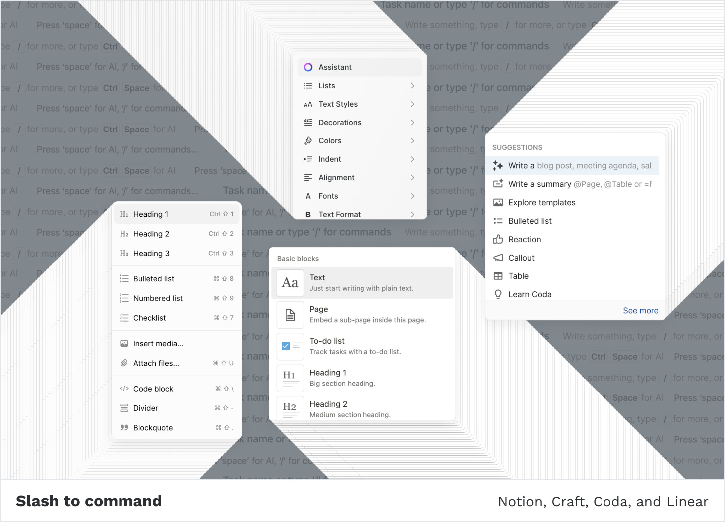
Popular document-based tools like Notion and Coda have built their products with a visual approach. Notion popularized not only the .so domain but also introduced a new way of writing and creating web pages. Prompting a command menu by typing "/" to insert built-in widgets like image galleries or rich data tables now seems ubiquitous in software across many fields. From conducting research to creating forms online—tools like Tally, Linear, Craft, and Dovetail are only a few that joined this movement in recent years.
Although borrowing the same slash-to-command feature, Roam embraced a more unconservative approach. It replaced buttons with [[weird syntax]], repurposed the sidebar, and popularized the term “graph” in a non-database context.
As Dan Shipper put it:
The underlying genius of Roam is that it is structured not like a tool, but like a programming language.
Indeed Roam is very much inspired by a niche programming language called Clojure. Furthermore, it's built with it. It's a flexible, small syntax language imparting a plasticine feeling. One can achieve many things using a small amount of building blocks. Much like Roam.
Over the past few years, we’ve seen a growing number of productivity and note-taking apps. Like Roam, they are all document-centric, with an editor at the heart of their products. Yet, they reside in a distant corner of the matrix.
Notion and Co. are all focused on workplace collaboration like task management and shared knowledge bases, packaged in a multiplayer experience. In the pure field of note-taking apps, there are Bear and Drafts which take a more classic vibe, like Apple Notes.
On the other hand, Roam focuses heavily on the text experience. Designed for personal use, it provides a unique freeform experience.
At its core, Roam is an Outliner—a bullet list structured software. Exploring the origins4 of Outliners goes way back to the 1980s when Dave Winer worked on ThinkThank. In contemporary software, Workflowy and later Dynalist are seen as evangelists for popularizing the outlining system. Despite its long history, Outliners remained a tiny niche.
Roam's extreme minimalist design might look simple on the surface. It suggests a simple, even dull interface to work in. As with any other Outliner, its main component is a bullet point.
Over the last decade, we've seen "complex" design patterns evolve. The infinite canvas, chatbot interface, and even the command line have become omnipresent in today’s tools. Compared to bullet points, these patterns are more appealing: sleek, and playful to use. Interacting with an interface through the act of drawing, or chatting might be more satisfying than typing bullet points over and over again. These patterns offer instant and rich feedback whereas bullet points are less immersive.
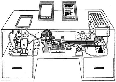
One of the things Roam excels at is remixing ideas—turning old ideas into modern art. A prime example is the revival of bi-directional linking, an idea first described as “associative trails” in Vannevar Bush's 1945 essay “As We May Think”. In his work, Bush imagined the Memex, a futuristic device allowing individuals to store, access, and link information. The Memex would serve as a personal knowledge base through associative indexing:
The owner of the memex, let us say, is interested in the origin and properties of the bow and arrow… First he runs through an encyclopedia, finds an interesting but sketchy article, leaves it projected. Next, in a history, he finds another pertinent item, and ties the two together. Thus he goes, building a trail of many items. Occasionally he inserts a comment of his own, either linking it into the main trail or joining it by a side trail to a particular item. When it becomes evident that the elastic properties of available materials had a great deal to do with the bow, he branches off on a side trail which takes him through textbooks on elasticity and tables of physical constants. He inserts a page of longhand analysis of his own. Thus he builds a trail of his interest through the maze of materials available to him.
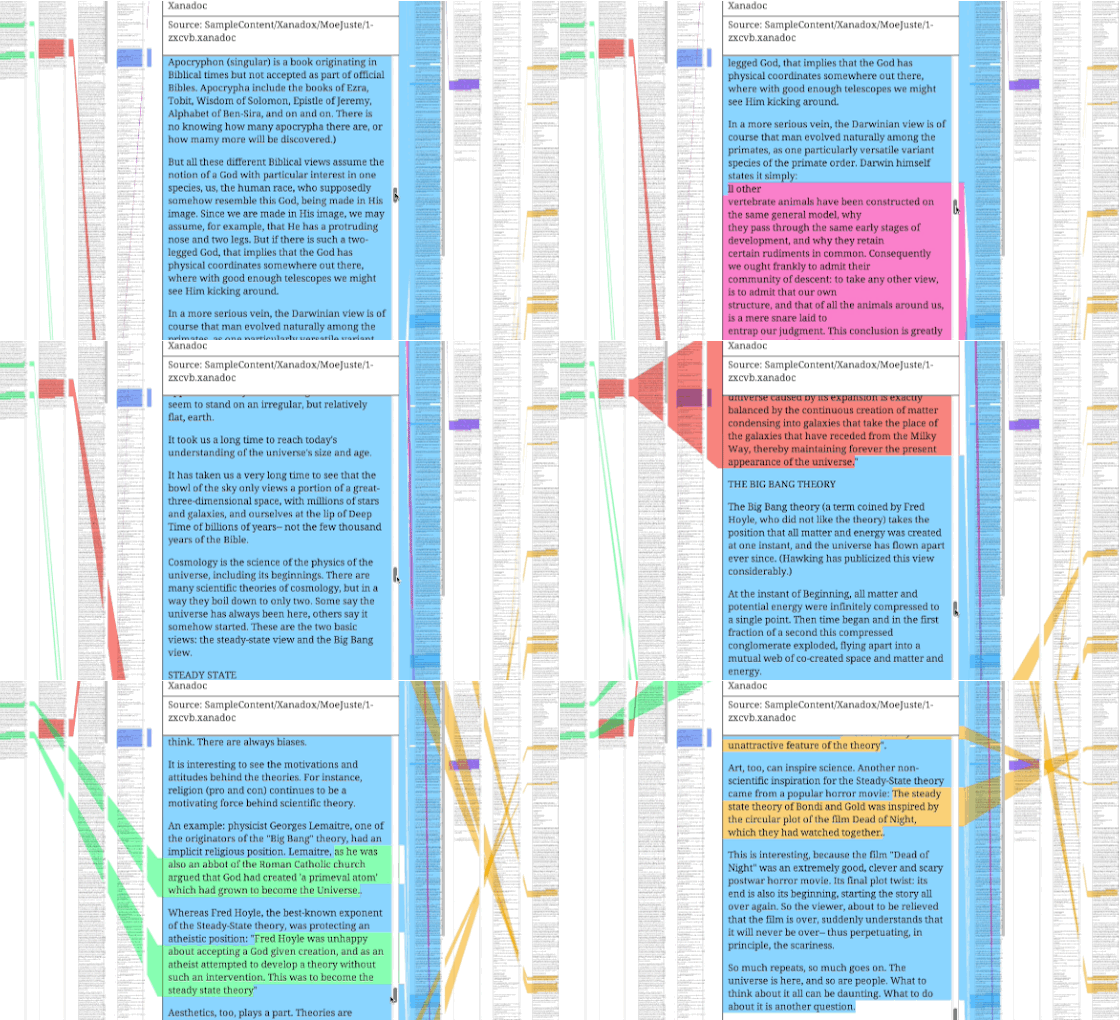
A decade and a half later, Ted Nelson began working on a hypertext system, known as “Project Xanadu”. Influenced by Bush's work, Nelson prototyped a digital library where all kinds of documents could be found, anywhere in the world. Unlike Bush, Nelson’s idea was to create a collective repository of information rather than a personal one. In Nelson’s version, associative indexing was called "zippered lists", or more famously “transclusion”:
These zippered lists would allow compound documents to be formed from pieces of other documents
Project Xanadu, Wikipedia
While being influential in the development of the World Wide Web, both projects fell short of their original visions. In hindsight, they might be considered instances of technology being ahead of time.
Nevertheless, it had to take a few more decades for the same idea to resurface again. In the Roam version, associative indexing is called bi-directional linking, and it’s an important core part of the experience.
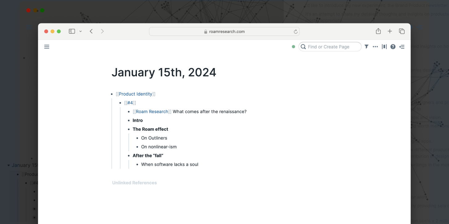
Inspired by nvALT, Roam borrowed the notation of [[double-bracket]] to link between entries. The experience is akin to writing a self-dictionary, where each entry gets a unique interpretation. Anything that goes between the brackets automatically becomes a link to a standalone page. Each page references every instance of the same “dictionary entry”.
This workflow enables resurfacing entire or partial entries. Roamers might add new comments, thoughts, or contexts as they remix existing pages or paragraphs into new entries. A modern Memex.
On nonlinear-ism
Traditionally, modern software is designed in a linear structure. Notably known as the “workspace”— a popular file cabinet structure, that reminds the parent-child relationship. Working in this structure conveys a feeling of playing a “pass the parcel” game. Every time you open a folder, the next one is revealed.
All this makes sense, as linearity is a human structure. From supermarket shopping to life skill courses, experiences are designed in a linear, progression path. The common streak pattern can be seen from afar in mediation apps, online coding courses, and learning apps.
Additionally, software follows a structured sequence. Starting with a sign-up and onboarding flow, such experiences are designed to walk the customer through a defined path. While trying to avoid the “blank page problem”, they become schematic.
And yet, Roam had challenged this approach.
After signing up, it seems like you get dropped into the deep water without any buoy.5 Although learning Roam is a gradual journey, its opinionated editor design features only a daily-titled entry on a blank canvas.
It's the “blank page problem” in its all glory.
Unlike most software, Roam is non-linear by nature. The fundamental essence of Roam is the ability to log entries and reference them over time. Roam acts as a time machine, allowing exploration across past, present, and seemingly future entries.
The Roam workspace is called a knowledge graph, and it takes a different approach. There’s no top-down hierarchy. There are no nested folders. Entried turns to pages, which live on the same level. Pages are treated as nodes, and their relationships are determined by how they are linked to each other.

These nodes become overwhelming very fast. Piles of texts get stacked and pages become scattered, conveying a sense of losing control. I remember this odd feeling just from visiting Roam's homepage for the first time.
At the time, taking notes in the Roam-way required adapting a new mental model. Learning the formatting and syntax was challenging, even for tech-savvies. Roam might have chosen a more standard onboarding to ease that pain, but I suspect grasping Roam is more of a cognitive rather than a usability barrier.
Leaving the “I need to first understand this product's benefits” approach outside the scope might be derived as a result of prioritization. However, it did fuel the FOMO with a burst of tutorials, courses, and workshops of live onboarding sessions.
Mastering Roam involves a daunting learning curve, not just in terms of the hours invested but in the depth and complexity of the knowledge required. In that sense, Roam reminds the process of learning a new skill, rather than a product. It involves understanding many new concepts and acquiring knowledge. It demands patience, more than a simple onboarding process of a few seconds or minutes.
After the “fall”
Roam popularized the networked thinking method, transforming it from an unheard-of niche to a widespread practice. It led people to switch from the librarian to the gardener mode, advocating a manifesto switching away from Evernote.
Roam’s impact echoed through many different spheres. The overall excitement around it and its un-boarding led people to become advocates. Nat Eliason created the famous "Effortless Output" course and sold it like hot-(expensive)-cakes at the time. Before productivity gurus like Ali Abdaal and Thomas Frank began making tutorial videos, people like Shu Omi has leveraged Roam's rise to start a YouTube career.
The rumor about an exciting new tool quickly spread. It had fulfilled the dream of any Silicon Valley-based startup: becoming recognized by the upper class. Kevin Rose, Patrick Collison, Venkatesh Rao, Erik Torenberg, Jeff Morris Jr., and visakan veerasamy were among the first investors and customers.
However, its success created a vacuum. As a company that drew so much attention, it developed high expectations from the vast crowd. Once Roam started to feel stale, fans turned into vocal critics. Rants have been discussing Roam's performance, product development, and even its co-founder's personality.
A massive influx ensued as people abandoned the allegedly sinking ship to find others to jump onto. Ironically, it was Roam that paved the way for alternatives. As soon as Roam gained traction, it proved there was room for more networked thinking tools. A growing list of Outliners integrated with bi-directional linking started to appear like mushrooms after the rain.
Many seized the opportunity to build alternatives focused on different approaches. A landscape map can be drawn out only from a few of them: Athens Research (RIP), and Logseq took the open-source direction. Reflect focused on trendy UX and more advanced features. Obsidian was built with a local-first principle, while Subconscious has taken the blockchain/protocol approach.
Long live the bullet list!
Yet, the decline of Roam's popularity isn't tied only to its seeming lack of growth or scale. In other posts writers Casey Newton and Dan Shipper describe a shared experience. It seems to be a misalignment between the tool and its premise:
But the original promise of Roam — that it would improve my thinking by helping me to build a knowledge base and discover new ideas — fizzled completely.
Casey Newton, Why note-taking apps don't make us smarter
At least for me—and most of the people I know—we got a garbage dump full of crufty links and pieces of text we hardly ever revisit.
Dan Shipper, The Fall of Roam
Even famous Nat Eliason once tweeted that he went full circle back to analog notes.
From a personal standpoint, I can relate to this notion. I’ve never been an avid note-taker. The least I do is open the Apple Notes app or sketch down ideas and wireframes in my sketchbook. Finding a systematic way to capture thoughts and ideas was never my thing. It always seemed too rigorous to me. And as a non-university graduate, methods like GTD or PARA sound like academic courses I should avoid.
I did spend a few long months using Roam. Similarly to Shipper’s experience, I ended up with a beautiful mess of a gigantic amount of information. However, as I mentioned before, figuring out how to use Roam requires a mental adaptation. Navigating a sea of text blocks isn’t a fit for everyone. I also remember that humanities and STEM subjects are two different expertise, for two types of people.
When software lacks a soul
I rant quite a lot about the current state of product design in tech. It’s one of the topics that most interest me. It’s also a big source of motivation for writing this very own publication.
Finding a soul as a product today seems rare in software. The rise of CSS frameworks like Tailwind and others has lowered the bare minimum entry for making a good-looking design. It made life easier but at the same time seemed to degenerate people’s creativity. Alongside trends that come and go, many products and websites look very much the same.
More profoundly there’s this idea of smallness I adore, once brought to my attention by designer Ben Pieratt:
What I’ve noticed since leaving Svpply is that other industries treat their 1% differently. In the fashion or magazine industries for instance, they give the creative output of their star members their full attention. The 1% is the whole thing. There’s no open invitation to contribute content to Monocle.
With hindsight, I feel the reason Svpply never grew into anything substantial is because we misread the opportunity. Smallness was the steam that drove our engine and we opened the gasket.
The familiar social network pattern is to aspire to convert the whole world into a member.
We think there’s room for a different approach. A social network that’s both niche and healthy. A social network that’s more magazine than platform.
The desire to build an empire, instead of a small village is one of the biggest evils in tech. For many startup founders, the holy grail is to achieve the hockey stick—an ethos that has long been spreaded by VCs and tech veterans.
User declining might be a negative metric for showing in investor updates. However, in some cases, such a scenario can be quite healthy for a product to sustain. Roam’s fall may not be that genuine after all. I wonder whether it’s just the narrative that plays into the hands of VC-like minds and traditional publications that chase after these kinds of “failures”.
Looking from a distance of 12,000 km might be deceptive, but the smallness thesis seems to apply to Roam.6 Eliminating the noise is a good quality for any software, especially after a super-hype that everyone wants to be a part of. It only makes sense that not all of Roam’s early adopters were the right audience: even the greatest evangelists who seemingly made a fortune out of the hype, or those who were most recognized with it.
Backlinks might have become a convention that’s here to last, but writing a {{query: {or: [[using]] [[components]] }}} isn’t for everyone. But that’s largely part of Roam’s soul. Productivity aficionados and note-taking enthusiasts, particularly in the Roam style are a very specific niche. In a recent post, members of the Roam community praised the “lack of new features”, or “it still looks like 2020” as a feature, not a bug7. It seems that Roam found its true believers, and not just those who once purchased a Believer plan and canceled it. Roam's community may have shrunk, but it remains strong.
Despite new successors having taken the lead in the ever-lasting competition of note-taking apps, Roam remains unique. From day one it didn’t look like a Tailwind-themed website. It didn’t incorporate big drop-shadow buttons or trendy animations. Others might be flashier, elegant, or shinier, but Roam’s uniqueness is reflected by how it doesn’t “fit” the conventional design model. Conor, Roam’s co-founder once summed up this view in response to an unsolicited redesign of Roam’s homepage:
From the beginning, there was something about Roam’s simplicity. It wasn’t been aligned with what people used to see. The monotony of its homepage and “boring” colors reflected a sense of boredom. It felt naive but in a good way.
It didn’t look like a copycat.
Instead, Roam was, and still just being itself.
One last thing. I put a lot of effort into writing this publication. It takes me 3-4 weeks to research, write, and edit each post. If you find the above worth your time, consider supporting with a coffee or gym membership pledge.
That was identity #4 of Product Identity. Thanks for Matt Brockwell, and Michael Walsh for reading drafts and contributing to this post.
Further reading
Explore research material for this post in the Are.na channel
The term was coined by Tiago Forte
Personal knowledge management
People like Maggie Appleton, Tom Critchlow, Andy Matuschak, and Anne-Laure Le Cunff
Read more: 1) Yury Molodtsov, The Evolution of Outliners 2) Wörtergarten, A history of outliners
The static, floating "?” icon is available, but it doesn’t serve as a guiding tour toward a defined path.
I’m well aware of the fact Roam is a VC-backed company. However, from the outside, it seems that despite being “driven” by other interests, it takes a different approach, which is not growth at all costs.
Is there an alternative to constantly adding endless features? Can software be designed to operate without daily updates, similar to programming languages?










Great article.
I think you just missed one important aspect which is the "Research" part of Roams name.
It may not be well known, but it's not for show. Roam was founded with an objective (I think Conor has described vision of it as it being a prosthetic for thought or something like that), which they don't feel like they have accomplished with what they released. I think specially how collaboration works.
I wouldn't be surprised if in couple of years Roam has become dramatically different.
We've no insight into their process, their ideation or the results of their experiments which I think it's a shame, but I find it beautiful that there are founders so focused on solving a problem.
One of the engineers recently posted something on the Slack which addresses this as well:
"Roam is much more a research company than most people realize. A significant portion of our effort and time go towards research into new and better approaches to augment (individual & collective) intellect. This research is really important and sometimes really fruitful (for example: the set of features that propelled Roam and arguably renewed the TFT landscape in 2019/2020 started from a period of intense research by Conor&Josh). However, almost by definition, the outputs of research cannot be guaranteed to happen within a particular period of time. We currently (and over the past few years) have had a number of research directions, and, from the public POV, this can look like no work was done. (Additionally, this high emphasis on research also means that roadmaps do not work that great for us :sweat_smile:)"
This was such a nice walk down memory lane. I was Conor's assistant in 2020, and this really brings me back. Roam is an elegant tool, and I still use it daily. I think of it like a sober LSD trip through the interconnections of my mind. Roam is one tool of many that extends the computation of my brain. It takes skill to weld, and it's not for the weak.